Article: The Return (And Staying Power) of Moody Decor: How Darker Interiors Became (Once Again) Deeply Desirable
The Return (And Staying Power) of Moody Decor: How Darker Interiors Became (Once Again) Deeply Desirable
For years, bright whites, airy neutrals, and pared-back minimalism dominated interiors. Rooms were meant to feel light, calm, and effortless. Then something shifted. Over the past two decades, a different mood began to emerge—richer, deeper, more atmospheric. Dark florals, inky walls, layered textures, and dramatic wallpaper entered the conversation. “Moody” design was no longer niche. It became one of the most compelling directions in contemporary interiors.
Where did moody décor begin?
Moody interiors did not appear out of nowhere. Their roots stretch back much further.
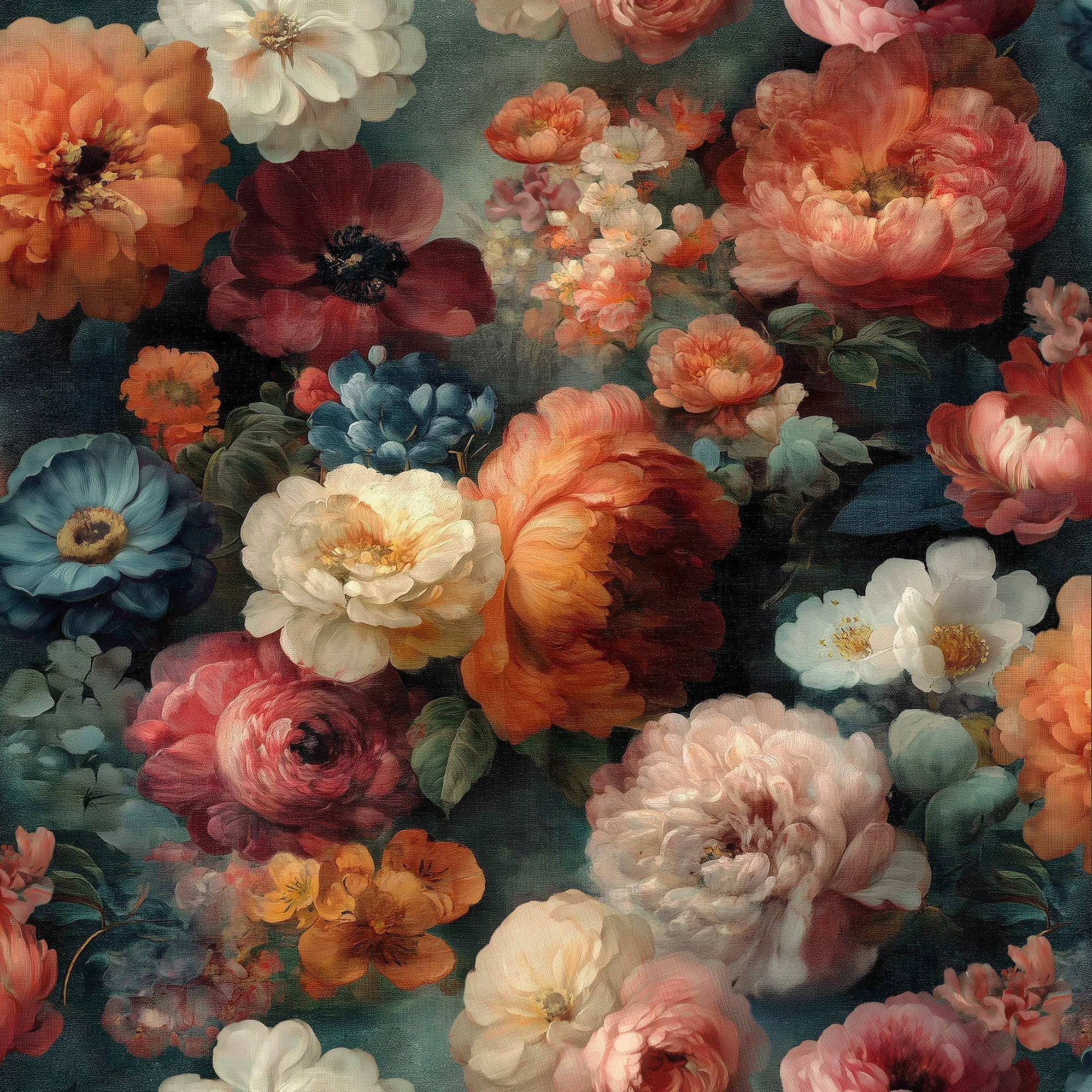
Historically, dark and richly layered interiors can be traced to Victorian-era homes, where saturated color, ornate detailing, heavy textiles, and richly patterned walls created rooms that felt intimate, enveloping, and expressive. Many of the visual cues that define today’s moody interiors—deep greens, burgundies, charcoal tones, botanical motifs, antique-inspired florals—draw directly from that tradition.

Example of Medieval Tapestry
What feels new is not the language itself, but how it has been reinterpreted for modern living.
When did the modern moody movement take hold?
The contemporary version of moody interiors began to gather momentum in the late 1990s and early 2000s, and accelerated significantly in the 2010s.
Part of this rise was a reaction against the increasingly dominant minimalist aesthetic. After years of bright white walls, sparse styling, and Scandinavian restraint, many homeowners began craving spaces with greater depth, personality, and emotional richness.
Social platforms such as Pinterest and Instagram helped amplify the trend, making richly layered interiors instantly shareable and aspirational. The “dark academia” aesthetic that emerged online in the mid-2010s also helped bring deeper palettes, vintage references, and atmospheric storytelling into mainstream design conversations.

https://www.veerdecor.com/products/vintage-floral-peel-stick-wallpaper?variant=49561756008688
The role of film, fashion, and pop culture
Pop culture undoubtedly helped shape the mood.
The cinematic worlds of Tim Burton have long celebrated gothic romance, dramatic contrast, shadow, and whimsy. Films like Edward Scissorhands and Sweeney Todd helped make darkly theatrical visual language feel emotionally rich rather than merely somber.
Then came Baz Luhrmann’s Moulin Rouge! in 2001. Its lush reds, layered textures, velvet decadence, and heightened theatricality offered a new kind of visual maximalism—opulent, sensual, immersive, and unapologetically expressive. The film’s production and costume design became influential well beyond cinema and was noted for influencing fashion and decorative culture.

Fashion played its part as well. Across the 2000s and 2010s, romantic gothic influences, Victorian references, jewel tones, velvet, florals, and darker palettes repeatedly surfaced on runways and in editorial styling. Interiors often follow the emotional cues of fashion, and moody design benefited from that broader cultural appetite.

Image Source: Moulin Rouge! (2001) / Photo: TM and Copyright © 20th Century Fox Film Corp. All rights reserved. Used for educational and design commentary purposes.
Why people are drawn to moody interiors
Part of the appeal is emotional.
Bright interiors often communicate openness, freshness, and simplicity. Moody interiors communicate something different: depth, intimacy, comfort, sophistication, and atmosphere.
A darker palette creates visual enclosure. It softens edges. It can make a room feel quieter, more layered, and more immersive.
For many people, moody interiors also feel more personal. They often suggest confidence, individuality, and a willingness to move beyond formulaic decorating.
There is also something deeply sensory about them. Rich wallpaper, matte finishes, velvets, layered woods, and soft lighting create rooms that feel less purely visual and more “experiential”.

Veer Decor Moody Floral Peel & Stick Wallpaper - VRPS001-01
https://www.veerdecor.com/products/moody-floral-peel-stick-wallpaper
Moody wallpaper: the defining element
Wallpaper has become one of the most powerful expressions of this movement.
Rather than relying only on dark paint, homeowners discovered that wallpaper could introduce depth, complexity, and narrative all at once.
Moody wallpaper often features:
- oversized florals
- shadowy botanicals
- tonal layering
- vintage-inspired pattern work
- richly saturated hues such as midnight blue, forest green, aubergine, rust, and charcoal
It adds drama, but also softness. It creates mood without feeling heavy. And unlike minimal surfaces, wallpaper tells a story.

Veer Décor Floral Painting Peel & Stick Wallpaper - VRPS002-02
https://www.veerdecor.com/products/floral-painting-peel-stick-wallpaper?variant=49561755910384
And while many tend to equate “moody walls” with more romantic or vintage designs, color alone can easily bring a more modern or transitional pattern into the moody realm. For example, this deep blue colorway — paired with a raised, powdery metallic glint — gives the wallpaper an undeniable sense of moody sophistication, creating a rich, atmospheric backdrop that feels both modern and enveloping.

Veer Decor Baha Dunes Wallpaper 8251-AJ3
https://www.veerdecor.com/products/bahia-dunes-wallpaper?variant=47534516666608
Why the trend feels lasting
What makes moody décor resonate is that it feels both timeless and contemporary.
Its historical roots give it familiarity. Its modern editing keeps it fresh.
Today’s moody interiors are often less ornate than their Victorian predecessors and more refined than earlier maximalist interpretations. They balance drama with restraint. Depth with sophistication.
That balance may explain why the trend has endured.


Veer Décor Shimmering Floral Canopy - VRAD09-425
https://www.veerdecor.com/products/shimmering-floral-canopy-on-foil?variant=46654574625008
Where moody design is headed
If recent years are any indication, moody interiors are evolving rather than fading.
We are seeing darker palettes paired with cleaner lines. Romantic florals with contemporary furniture. Atmospheric wallpaper used in more curated, intentional ways.
The mood remains—but it feels lighter on its feet.


Veer Décor Embroidered Cherry Bloom Wallpaper - 8389-AB6
https://www.veerdecor.com/products/embroidered-cherry-bloom-wallpaper
In many ways, moody design reflects what many people want from home today: not simply a beautiful room, but a room with feeling.

Moody in spirit… Mod & Mid-Century in design! Veer Décor Stitched Arches Wallpaper. 8385-AC7 https://www.veerdecor.com/products/stitched-arches-wallpaper
Veer's Wrap-Up:
Moody décor emerged from historic richly layered interiors, gained momentum through film, fashion, and a reaction to minimalism, and resonates today because it creates spaces that feel intimate, expressive, sophisticated, and emotionally immersive.

Veer Décor Palm Haven Wallpaper - 8375-AE2
https://www.veerdecor.com/products/palm-haven-peel-and-stick-wallpaper?variant=48094969823472

